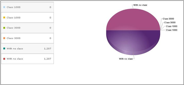
As we all know, Pie Chart is a special chart that uses “pie slices” to show relative sizes of data. Pie charts can be used in Sage CRM for a graphical representation of data. They are directly inherited from Graphics and are an extension of the Graphic Block.
Here if we wish to see a graphical representation of data for a particular entity, we can develop a custom page and use the same to display information in graphics.
Below is the example of adding the same for the Company entity.
CRM connects to the Company table and obtains the information. To create a chart for Company entity, you need to follow the below steps.
- Create a new tab named PieCharts under My CRM, that links to a custom page.
- Create the custom asp page to display the chart.
- Below is the code to be added to the asp file.
<!– #include file =”sagecrm.js” –>
<%
var sContainer=CRM.GetBlock(“container”);
var strSQL = “select count(comp_companyid) as ‘mycount’, ‘Class 1000’ as ‘mytype’ from Company where comp_deleted=0 union select count(comp_companyid) as ‘mycount’, ‘Class 3000’ as ‘mytype’ from Company where comp_deleted=1 union select count(comp_companyid) as ‘mycount’, ‘With no class’ as ‘mytype’ from Company where comp_deleted is null”;
var myBlock=CRM.GetBlock(“chart”);
with(myBlock)
{
Stylename(“Pie”);
xlprop=”mytype”;
yprop=”mycount”;
SQLText= strSQL;
ImageWidth=950;
}
sContainer.AddBlock(myBlock)
Response.Write(sContainer.Execute());
%>
To view the results, select My CRM and click on PieChart tab to see below output.


