Sage CRM’s reporting feature has always been proved helpful to view the summary data. Report’s data extracted in rich graphic and interactive graphs has improved the look and feel as well as gives better clarity. Sage CRM 7.3 has come up with some new chart styles which can prove helpful for Sales as well as management users to better understand the report content.
New Stuff: Pipe Line failure with regional currency configurations
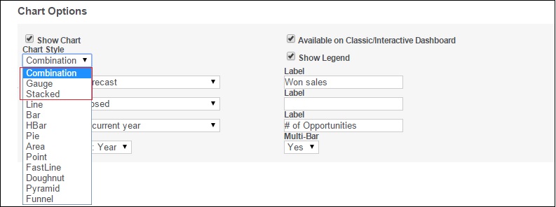
In this blog post, we will explore the various chart styles made available while creating a report. The basic setting of creating a new report or editing the existing format will remain under the Reports section of Main menu. Chart options are made available on Step 2.

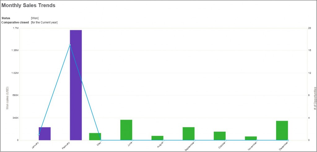
Selecting the Combination style will display the report content in combined form of Line and bar graphs as shown below

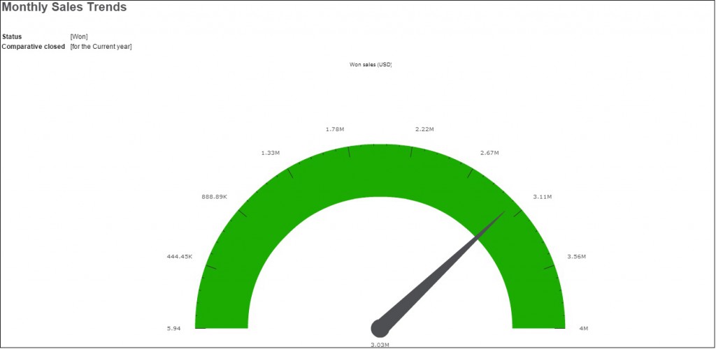
Selecting the Gauge style will display the report content as shown below

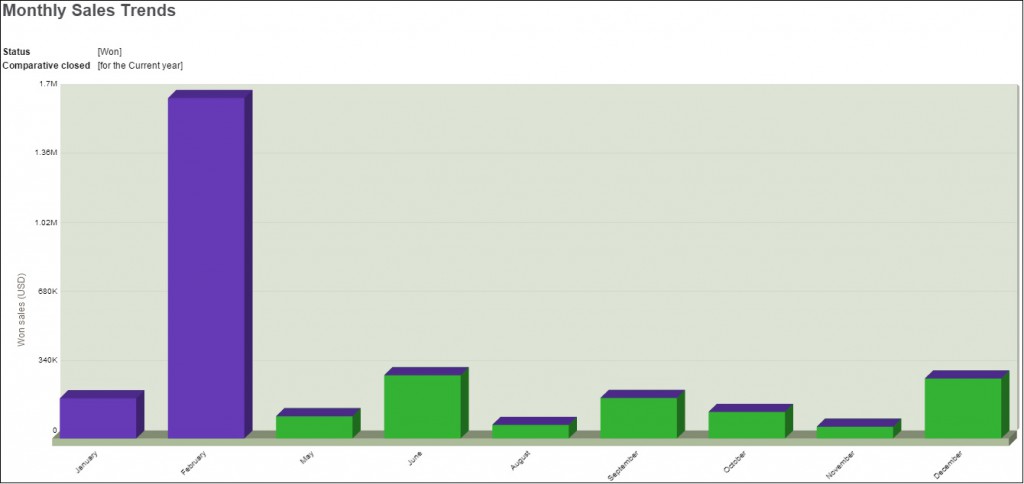
Reports extracted in Stacked style will look as shown below

Also Read:
1) Quote Summary Screen Enhancements in Sage CRM 7.3
2) Lead De-duplication nice to have feature in Sage CRM 7.3
3) Expect smarter Email Marketing in Sage CRM 7.3 with MailChimp integration
4) Introduction of New Theme in Sage CRM v7.3
5) Control Access to Merge to Word button in Sage CRM v7.3
Sage CRM – Tips, Tricks and Components
Explore the possibilities with Sage CRM insights through our comprehensive blogs. As a leading Sage partner, Greytrix helps businesses maximize their Sage CRM potential with its rich expertise and immense knowledge. Here, you will find blogs that feature expert advice, tips & tricks, best practices, and comprehensive guides on customizing and configuring Sage CRM for your business. Stay informed with our regular updates and expert insights!

